TusLi field Hockey Club Design Project (2022)
This project was completed as a part of the studies at SRH Berlin School of Design and Communication. The aim was to redesign the logo and give an ovehaul to the whole image of a local field hockey club on the outskirts of Berlin. It's a small club for mainly teenage and child members, so the design was to be fun and fresh, and reflect the youthfulness of the members. As a part of the project, extensive interviews with the members were conducted. The next part of the process were design thinking processes and brainstorming solutions for the new corporate design. You can see the results of our team of 4 below.


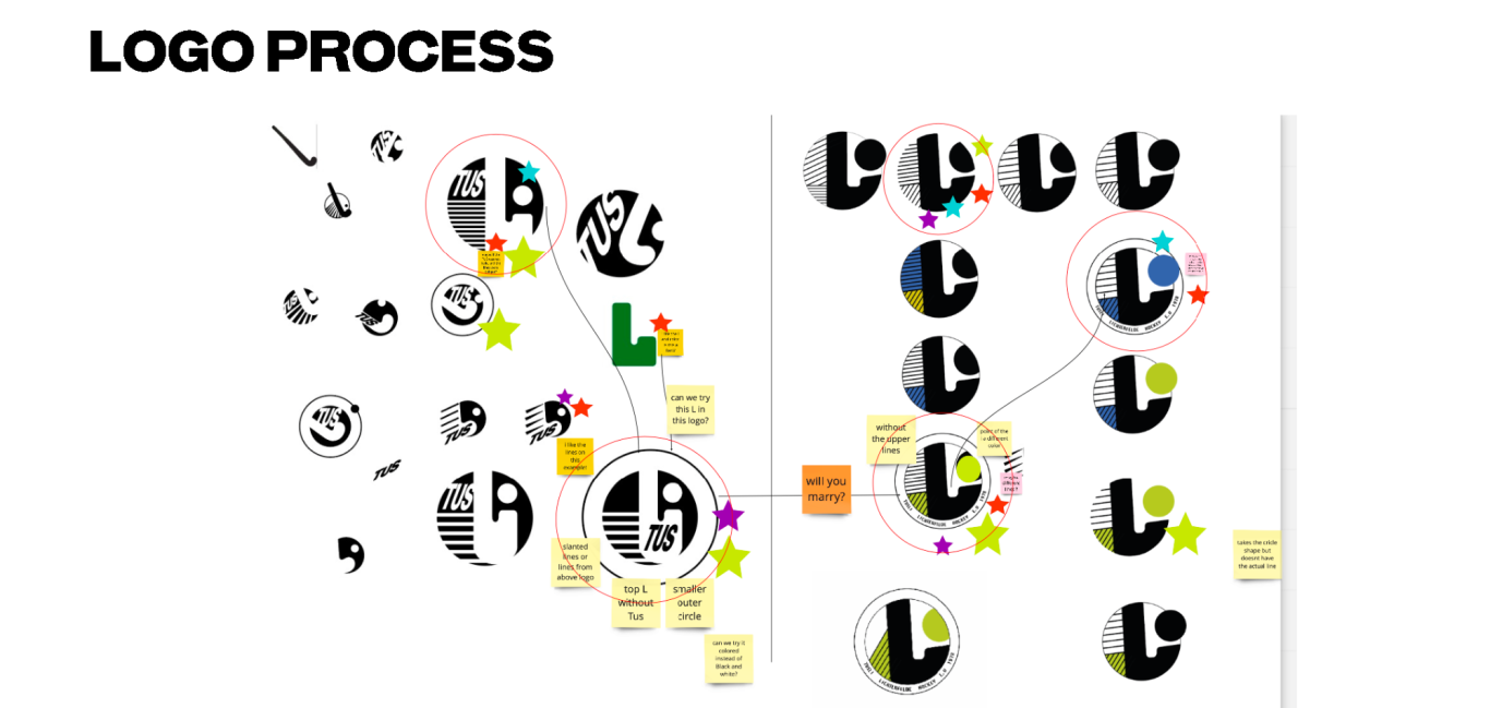
Here you see the logo that our team created. It reflects the youthful and fresh spirit of the club members, with electric blue being chosen as the main colour for the coloured logo.
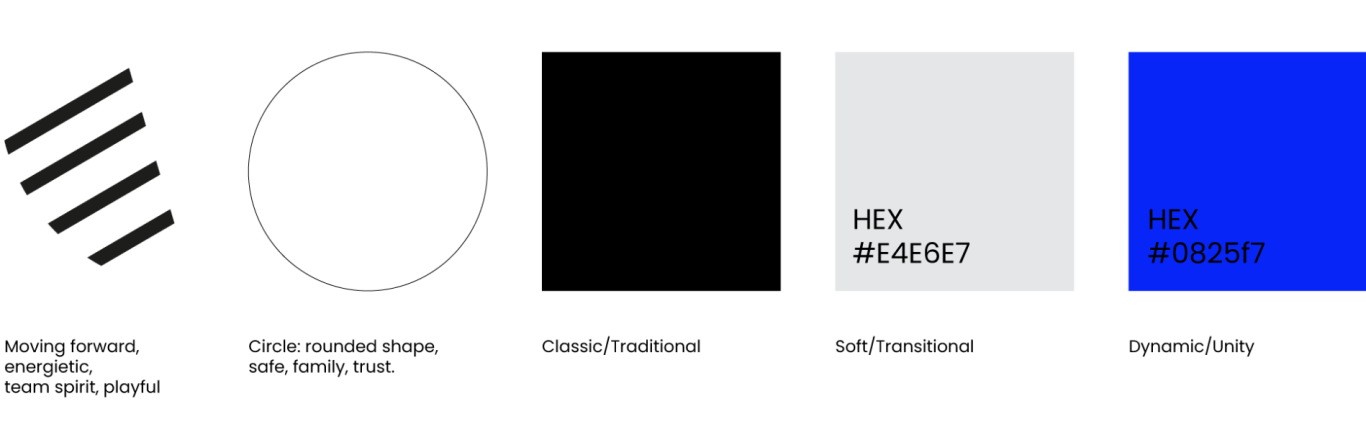
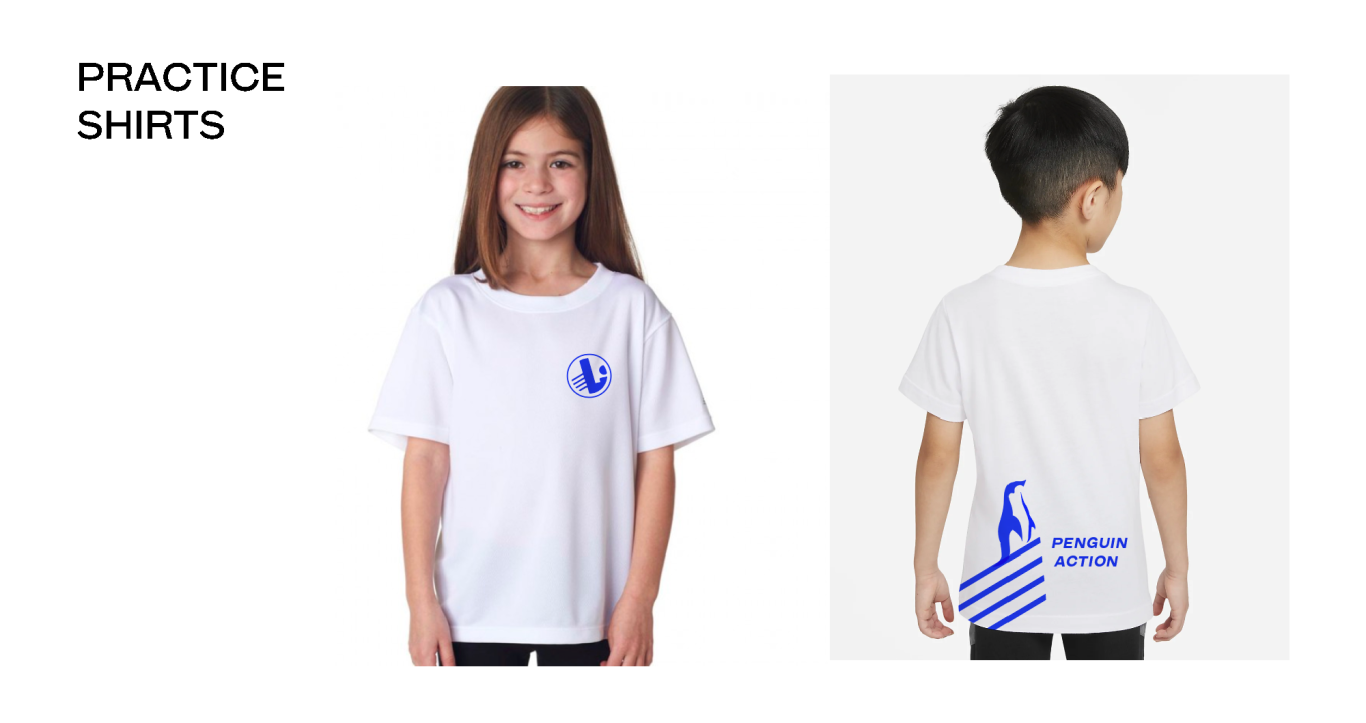
Below you will see the signature colours that were chosen for the new corporate image, as well as the logo creation process and other facets of our solution.
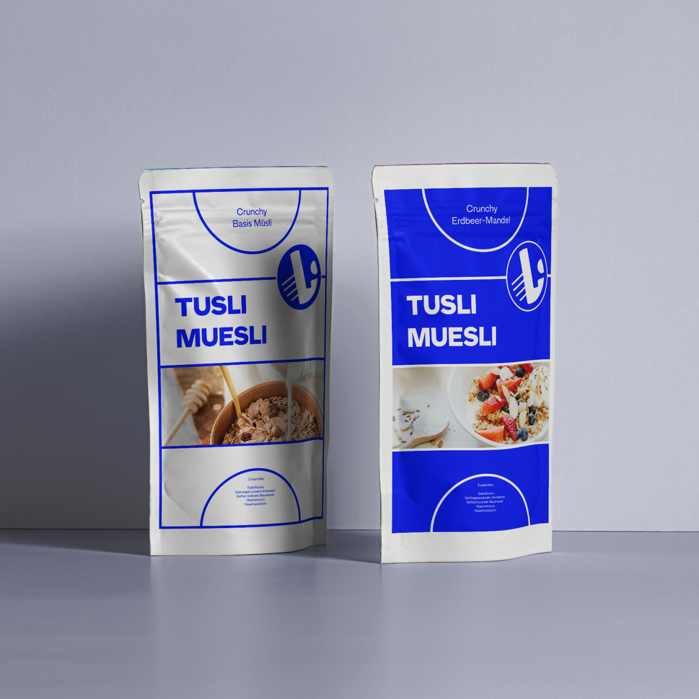
Here you can see the package design for our concept of "TusLi Muesli," which could be used as a social business idea, earning money for the club's needs while providing the club supporters with a tasty and well-packaged snack.
Wir benötigen Ihre Zustimmung zum Laden der Übersetzungen
Wir nutzen einen Drittanbieter-Service, um den Inhalt der Website zu übersetzen, der möglicherweise Daten über Ihre Aktivitäten sammelt. Bitte überprüfen Sie die Details in der Datenschutzerklärung und akzeptieren Sie den Dienst, um die Übersetzungen zu sehen.